How to paint Aegean Friday
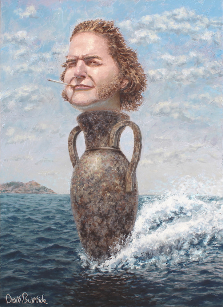
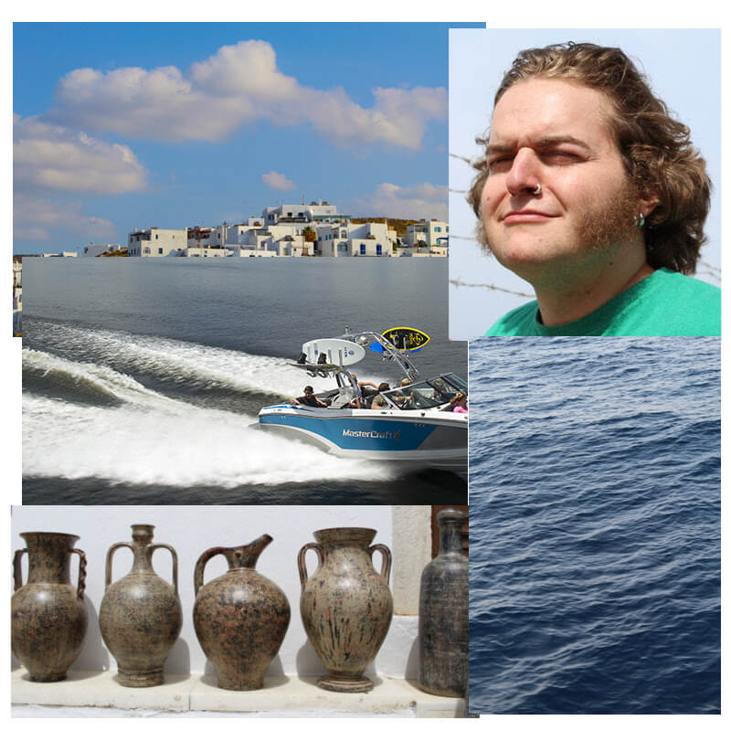
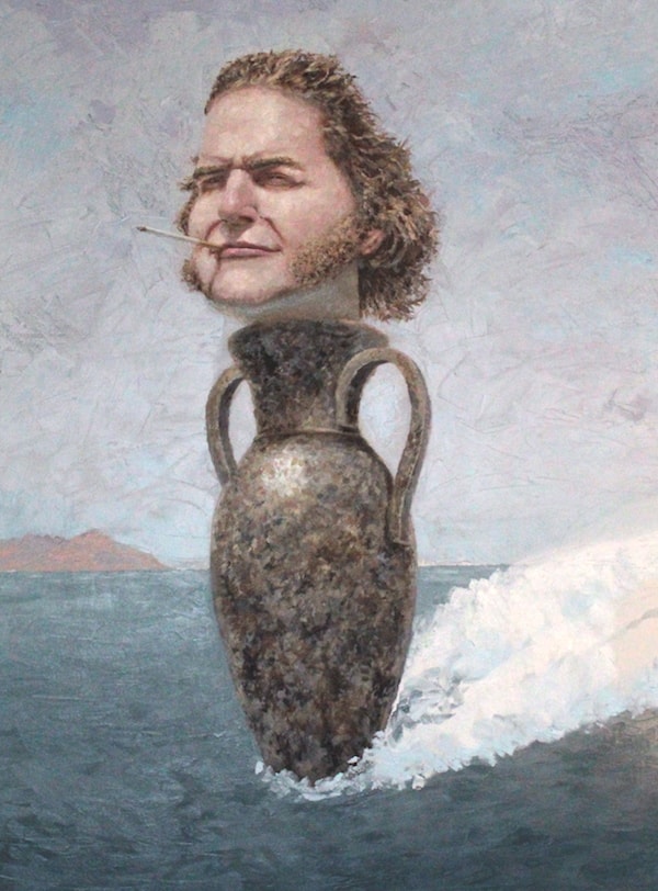
After an amazing vacation to Greece, I had hundreds of photos in my new camera. There were so many photos that would have made great paintings that I could not choose a single one- so I combined several to make Aegean Friday, with my brother Bennett Burnside as the model.
As usual, I gather my reference photos and create a mockup in photoshop. The mockup allows me to visualize the composition and color
schemes before I ever touch a paintbrush.
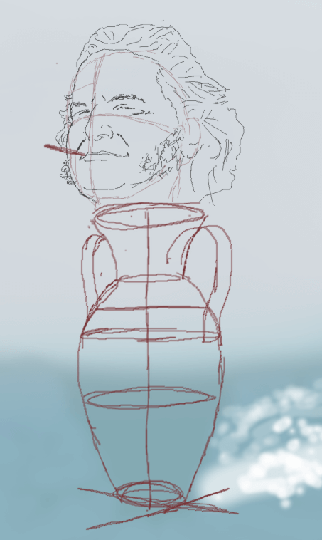
Step 1: blocking in the head
Keep in mind, lighting conditions across my photos were inconsistent, so the colors you see
are not completely true to life. In my studio I had both warm & cool light bulbs to attempt a color-neutral
lighting, which is why the one half of the canvas looks more blue / red.
After transferring the mockup forms to the canvas with the help of a projector, I mix a few shades of flesh.
To keep it simple, I start with only a few shades- those in sunlight and those in shadow. My paint will stay wet for
at least a day, so I have plenty of time to mix them and add small amounts of non-fleshy colors, which make the skin
look less flat and boring.
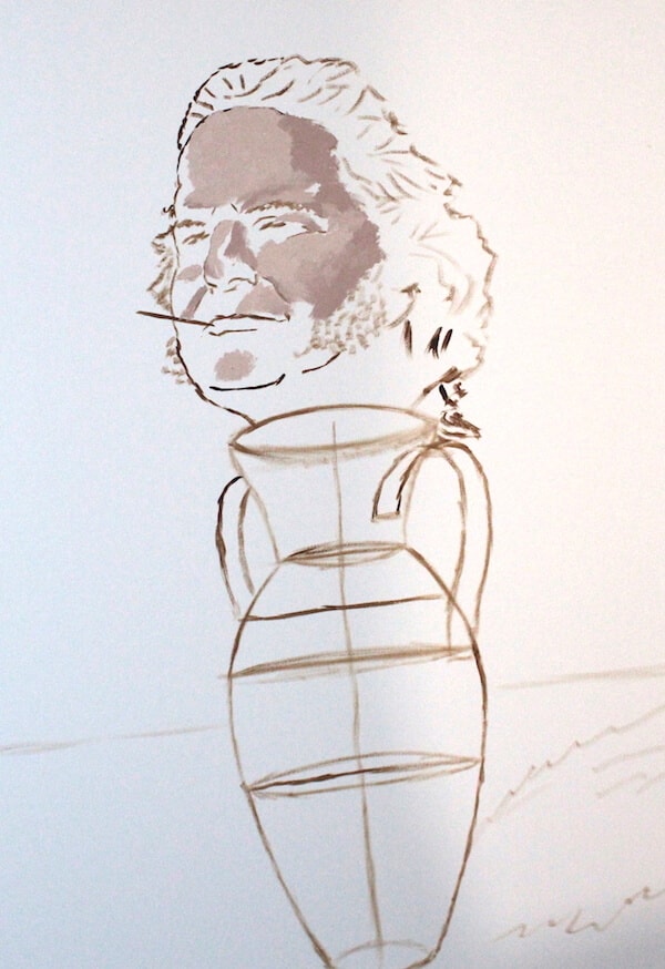
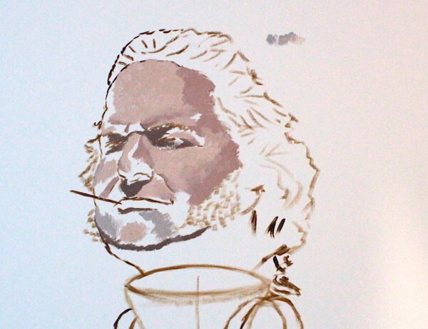
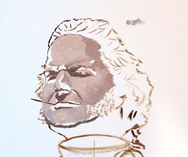
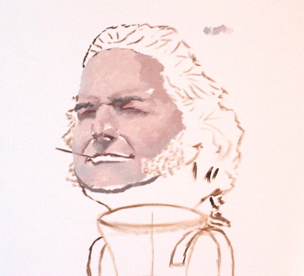
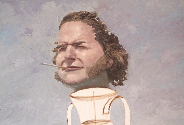
I’m using a large brush, not concerned with small details yet. The most important thing at this stage is to create the subtle color gradients across the face. The color differences between the sunlit cheeks and shaded eye sockets are obvious, but the small value difference between the front and right sides of the face,for example, are just as important. Rarely will any surface be uniformly lit.
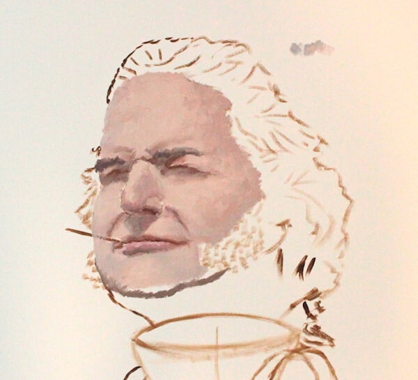
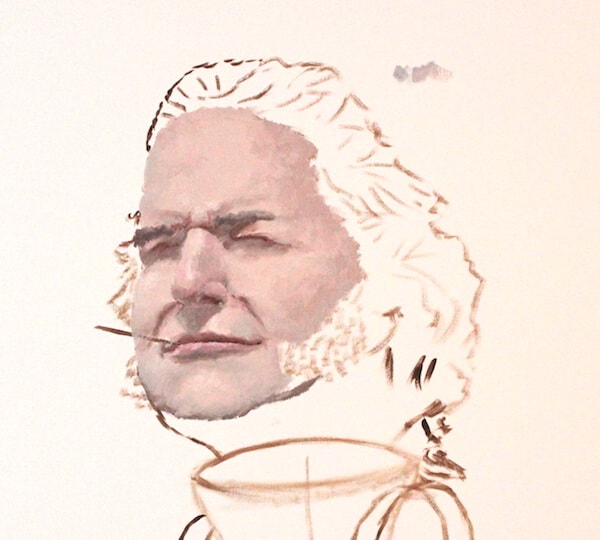
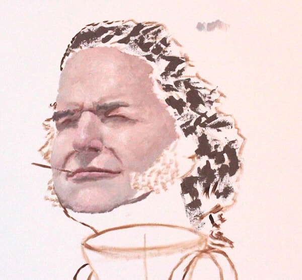
Highlights are added, and immediately the form of the face is much easier to see. After some
crude hair is added, completing the basic form of the entire head, I can understand the 3D geometry much
better, and I can add more subtle lighting changes to bring it out further.
I add some red to the nose to break up the color monotony. Some grey around the chin does the same
job, and the value difference between the grey and the highlight bring out the shapes even better.
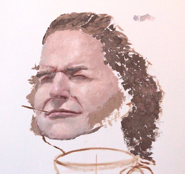
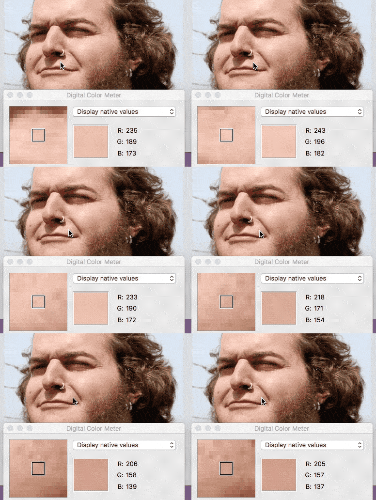
I’m carefully studying the reference photo, looking for these differences across the face. It takes a trained eye- But I also have a secret weapon- the color meter on my computer
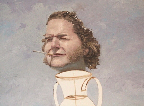
The hair is blocked in further, with the brushstrokes following the hair’s erratic windswept directions. Also notice the bright bluish patch unde the chin. This is from the ambient blue light of the water. In the reference photo, this same area is a green because of the light reflecting off Bennett’s shirt- that obviously needed to be changed, and I amplify the glow to show the strength of the water's reflections.
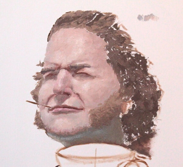
Step 2: sky and hair
The sky will have minimal details, so as not to detract from the foreground. I create a simple color gradient starting at the horizon. I add a little purple at the top for variety, breaking up the big wall of blue. And I use a palette knife to apply big gobs of thick paint in random sweeping motions: it gives an interesting texture to contrast the focused strokes of the face.
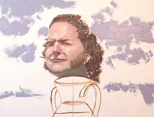
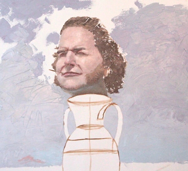
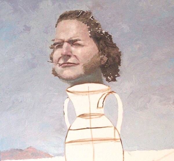
I blend thick chunks of sky in no particular order. I’m starting to really like the rough,
splotchy texture, so I dirty it up some more by dabbing the knife's face across the surface and letting the paint ‘Thhhlup’ as I peel it away.
I also add a few more details to the face, like the cigarette and fine lines of the hair.
By this point, my palette is
a circus of browns, reds and blues- but that's perfect, as I'm just about to start on the vase and I need a variety of colors.
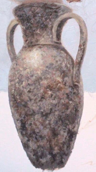
Step 3: the vase
Though the outside layer is smooth and shiny, the Greek vases have a very rough splotchy texture, with dark veins, clay-red patches, and speckled reflections. I’ll start with the darkest areas, dabbing random spots of my darkest browns. Every layer I add is a new color variation until I'm satisfied with it.
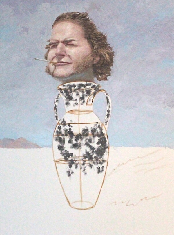
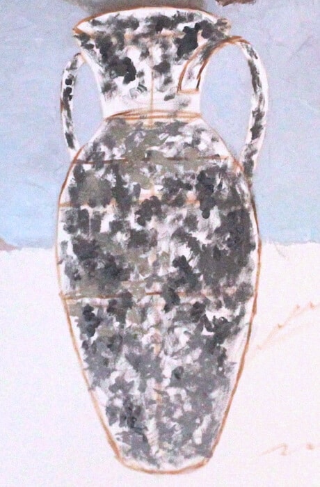
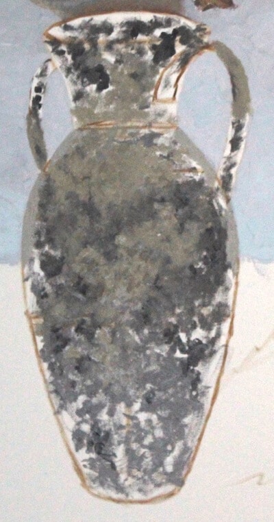
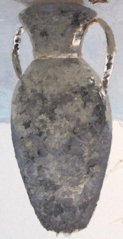
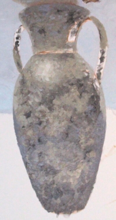
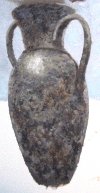
A strong highlight from the sun’s reflection, combined with another layer of dark around the vase’s bottom and the shadow of the head, really brings the vase to life. All I need to do now is refine the shape of the lip & handles with highlights and keep adding random dabs of color until I'm bored.
Step 4: the water
Just like the sky, there is a gradient in the water that travels top to bottom. Out toward the horizon,
where the viewing angle is almost flat, there is more much more sky light reflecting. The water becomes
lighter and slightly yellowish.
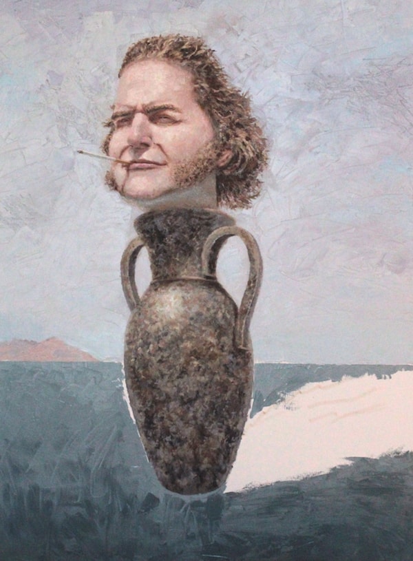
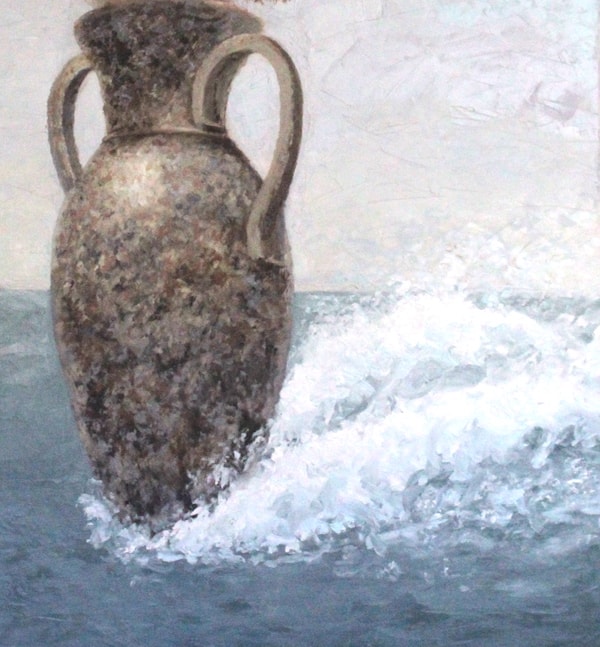
For the wakes, I’m using almost pure white. I create a water jet on both sides of the vase,
defining the shape with very light blue for shadowed areas. Because the jets are so turbulent
and chaotic, I have a lot of room for error in the shapes. I also add flecks of white above and
below the jets to convey the speed of the vase as it plows through water, whipping the water into fine spray
By now, the sky layer is already dry. I add puffy clouds to make it more interesting.
For the sun-facing parts, I use a yellowish off-white, slightly darker than the sea spray. This allows
the spray to still be the absolute brightest part of the painting, keeping it the center of attention
and making the vase’s speed even more tangible. It also allows more color variety in the sky (which now
has subtle purple and yellow, instead of just blue).
For the cloud's shaded parts, I use a color the same value as the sky behind it, just much less saturated.
On sunny non-overcast days, the darkest parts of a cloud will be the same value as the sky.
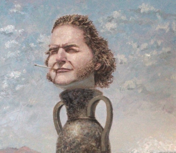
The water has 2 main layers: The first layer is the simple gradient, applied as thick smooth coat with a palette knife.
When that layer is dried, the second layer is added: The deep blue detail of the waves. I thin down the paint
the allow it to glide onto the smooth surface.
Obviously, the waves get smaller as they recede into the horizon. I add a single wave at various distances
to get the scales right.
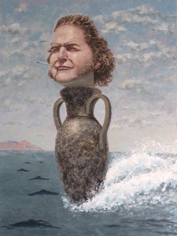
I use fast, intense strokes, creating long jagged pyramids. I get the big ones in first, then surround them with smaller peaks, letting them flow into each other. I also add more detail around the jets of water with dark blue.
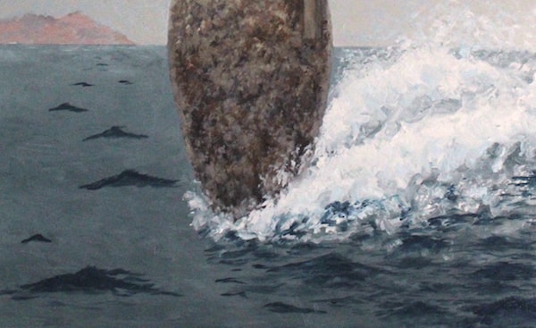
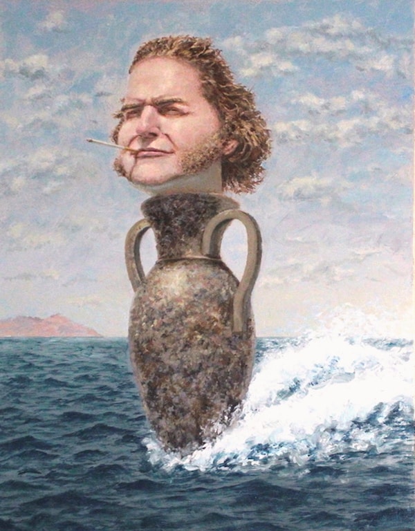
I let it sit for a few days to let everything dry.
There are a few shading imperfections in the face and hair to fix. The side of the neck need darkening because the
hair blocks ambient light. The handles on the vase need to be reshaped.
For the water, I add reflections of the vase and sea spray. I also further lighten the water toward the horizon
and slightly blend the line between ocean and sky, making it look hazy and ethereal.
There are rough details
added to the mountain, just a few patches of blue, brown, and green.
Finally, a signature, and it's complete!

Final Thoughts
This is a new style I was trying out- using rough strokes and thick gobs of paint. Usually I use thin layers and precise fine brushes. I had a lot of fun making this piece, and thanks to the broad strokes, I was able to finish it way faster than my other fine-brushed pieces.
What I don't like
In the reflection of the vase, the waves have a different texture than everywhere else- they seem too small. There should have been stronger sky reflections in this area too. There is also a disconnect between the angle the vase is facing and the direction of the water jets, almost like Bennett is 'drifting' across the water.
What I like
With color balance, I think I did pretty well. Blue is dominant, but it is balanced with off-yellows and the warm colors of the sunlit vase and face. For composition, I like the size / placement of the main subject, and the lines of the cigarette / sea spray gives good eye-flow. And I think the sea jets and swept-back hair do a good job of capturing the turbulent water
Posted August 27 2018

